
Laravel app iphone hide tool bar after link click (Step-by-Step Guide)
If you have built a Laravel app iphone hide tool bar after link click is probably a phrase you have searched for more than once. Many developers notice that on iPhone Safari the toolbar stays visible after a tap. Safari only hides its address bar when the user scrolls down, so moving to a new view alone will not trigger the collapse.
Apple designed this behaviour on purpose. iOS blocks developers from changing the browser controls to keep things secure and consistent. Even if you add custom JavaScript or adjust Blade templates Safari makes the final choice about when to show or hide its chrome. One useful workaround is turning your app into a PWA “standalone” mode by using the apple-mobile-web-app-capable meta tag. When people add your app to their Home Screen it opens in a clean frame that looks like a native app without the Safari URL bar on iOS.
Here are two quick tips for Laravel developers
- Make pages scroll smoothly so Safari hides the toolbar naturally
- Ask users to add your app to the Home Screen to open it in iOS web app standalone mode for a full screen experience
Quick Win JavaScript “Scroll Nudger” to Collapse the Toolbar
If your Laravel app still shows iPhone Safari’s toolbar after a page loads you can fix it with a tiny script. This JavaScript hide address bar iPhone method calls window.scrollTo(0,1) with a short delay. It acts like a small push on the page so the iOS Safari scroll hack hides the chrome automatically.
Getting the timing right is important. You can inject the script into your Blade layout so it runs after the DOM is ready or right after navigation. This keeps the effect smooth and reliable. Many developers pair this trick with Progressive web app(PWA) tips to make their app look and feel like a native iOS app.
How to Add the Scroll Nudger
You can add a small script at the bottom of your Blade layout. It waits until the page is loaded and then listens for clicks on links. After a short pause it scrolls the page just a little bit. Here is an example:
document.addEventListener('DOMContentLoaded', function() {
  document.querySelectorAll('a').forEach(function(link) {
    link.addEventListener('click', function() {
      setTimeout(function() {
        window.scrollTo(0, 1);
      }, 300);
    });
  });
});
This little movement is enough for Safari to hide the toolbar without disturbing your layout.
Make It Feel Even Smoother
If you want the scroll to feel natural you can use requestAnimationFrame instead of a timeout. This tells the browser to scroll right after drawing the page and can make the effect look more fluid.
document.querySelectorAll('a').forEach(function(link) {
  link.addEventListener('click', function() {
    requestAnimationFrame(function() {
      window.scrollTo(0, 1);
    });
  });
});
Special Cases in Single Page Apps
If your Laravel app uses Inertia.js, Livewire, or Vue Router, the page doesn’t reload fully when you navigate. In these apps, Safari sometimes doesn’t notice the scroll. You can fix this by running the scroll nudger every time a view changes:
// Vue Router
router.afterEach(function() {
  window.scrollTo(0, 1);
});

// Inertia.js
Inertia.on('finish', function() {
  window.scrollTo(0, 1);
});

// Livewire
Livewire.hook('message.processed', function() {
  window.scrollTo(0, 1);
});
Optional iOS Check
To make sure this script only runs on iPhones and doesn’t affect other devices, you can check if the user is on iOS Safari:
function isIOSSafari() {
  return /iP(ad|hone|od).+Version\/[\d\.]+.*Safari/i.test(navigator.userAgent);
}

if (isIOSSafari()) {
  window.scrollTo(0, 1);
}
Quick Tips
- Place your script at the bottom of the Blade layout so it runs after the page content loads.
- Use @section(‘scripts’) or @yield(‘scripts’) to keep your layout tidy.
- Pair this trick with PWA standalone mode for the best native-like experience.
How to Add the Script to Your Laravel Blade Template
If you want Safari on an iPhone to hide its toolbar, the first step is knowing where to put your script. In most Laravel apps, you can open resources/views/layouts/app.blade.php and add your JavaScript at the bottom of the body. This way, the page content loads first, and your little scroll trick works smoothly. Think of it like giving Safari a gentle tap so it knows it’s time to hide the toolbar.
One of the easiest ways to keep your scripts organized is by using Blade’s @yield or @section. You can create a @section(‘scripts’) at the end of your layout and drop your scroll code there. This keeps your layout clean and makes it easy to reuse on other pages.
It is also smart to make sure the visitor is using iOS Safari before running the script. You do not want it to run on Android phones or desktop browsers. Here is a simple example:
function isIOSSafari() {
  return /iP(ad|hone|od).+Version\/[\d\.]+.*Safari/i.test(navigator.userAgent);
}

if (isIOSSafari()) {
  window.scrollTo(0, 1);
}
This will only run on iPhones or iPads and automatically hide the toolbar. Other devices will stay unaffected.
Make It Friendly for Everyone
Progressive enhancement is all about improving the experience for iPhone users without breaking things for anyone else. Before adding this scroll code, make sure your pages still work normally even if the script does not run. This way, your Laravel app will stay stable and smooth for all users.
Wrapping your scroll function in a check for iOS Safari keeps it running only where it should. Users on other devices get the same page without any surprises. It is a simple change, but it makes your app feel much closer to a native iPhone app.
Tips for success
- Add the script after the page content has loaded
- Use Blade sections to keep layouts organized
- Test on multiple iPhone models to make sure the toolbar hides every time
The Long Term Fix with PWA and Add to Home Screen Mode
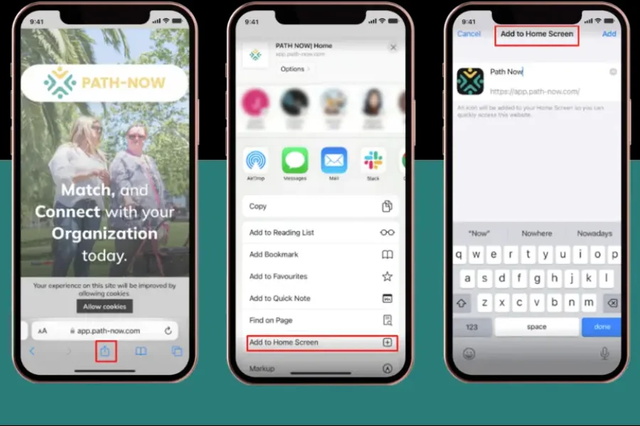
If you have tried every scroll trick to make your Laravel app iphone hide tool bar after link click, the real answer is to turn the app into a Progressive Web App. When a PWA is saved to the home screen it opens in its own window with no Safari bar showing at all. This is what makes your app feel like a true native iOS app.
You can do this by adding a manifest.json file and a few meta tags in your layout. These files tell iOS Safari how to launch your app and which icons to show. One simple way is to install a Laravel PWA service worker package or make your own service worker and manifest. Once that is ready you can guide users to add the app to their home screen so they get a clean full screen view.
Required Meta Tags and Manifest Settings
In your Blade layout, add:
<meta name="apple-mobile-web-app-capable" content="yes">
<meta name="apple-mobile-web-app-status-bar-style" content="black">
<meta name="apple-mobile-web-app-title" content="MyLaravelApp">
<link rel="apple-touch-icon" href="/icons/apple-icon-180.png">
<link rel="manifest" href="/manifest.json">
In public/manifest.json:
{
  "name": "MyLaravelApp",
  "short_name": "LaravelApp",
  "start_url": "/",
  "display": "standalone",
  "background_color": "#ffffff",
  "theme_color": "#000000",
  "icons": [
    { "src": "/icons/icon-192.png", "sizes": "192x192", "type": "image/png" },
    { "src": "/icons/icon-512.png", "sizes": "512x512", "type": "image/png" }
  ]
}
Key settings:
- apple-mobile-web-app-capable:
yes - display: standalone
- start_url: main page of your app
Icons and Start up Behaviour
iOS needs specific icons for the home screen. Add several Apple touch icon sizes so your logo looks sharp on all devices. You can also add maskable icons to control how your image is cropped when the app starts. With these details in place your Laravel PWA loads quickly and shows a splash screen that matches your brand.
Handling SPA Frameworks (Inertia.js, Livewire, Vue/React Router)
If your Laravel app uses a single-page framework it works like a train moving from one station to the next without ever stopping. Frameworks like Inertia.js, Livewire, and Vue or React Router swap out views without reloading the page. On an iPhone this can confuse Safari. The toolbar stays visible because Safari only hides it when it sees a real scroll. After clicking a link you may still see the bar you expected to go away.
The fix is simple. You just need to gently nudge Safari each time your app changes views. With Vue Router you can use the afterEach function to scroll the page a tiny bit. With Inertia.js you watch for the finish event. With Livewire you hook into the message processed event. These small nudges tell Safari that the page changed and it is time to hide the toolbar.
Where to Add the Code
You should put these snippets at the bottom of your Blade layout. This is usually the file resources/views/layouts/app.blade.php just before the closing body tag. Placing the code here makes sure it runs after the page content loads.
You can keep your layout clean by creating a section called scripts using Blade. Here is an example
<!-- resources/views/layouts/app.blade.php -->
<html>
<head>
    <title>My Laravel App</title>
</head>
<body>
    @yield('content')

    @yield('scripts')
</body>
</html>
Then in a child view or in a central script file you can add
<script>
    // Vue Router example
    if (window.VueRouter) {
        router.afterEach(() => window.scrollTo(0, 1));
    }

    // Inertia.js example
    if (window.Inertia) {
        Inertia.on('finish', () => window.scrollTo(0, 1));
    }

    // Livewire example
    if (window.Livewire) {
        Livewire.hook('message.processed', () => window.scrollTo(0, 1));
    }
</script>
This ensures your Laravel app hides the iPhone Safari toolbar after each view change. It makes your app feel cleaner and more like a real iOS app instead of a website in a browser.
The main point is that small scroll nudges after each page change can make Safari hide its toolbar and give your app a smooth, native feel on iPhone.
CSS and Safe Area Considerations
When you design your Laravel app for iPhones, you’ll notice things like the notch or the Dynamic Island. iOS automatically creates a “safe area” so your content doesn’t get hidden behind the camera or sensors. That’s helpful, but sometimes it can make Safari’s toolbar stick around even after you scroll or tap a link. Your app can feel cramped, and that extra bar just sits there.
The good news is you can fix this. You just need to let iOS know it can use the full screen. Add this to your meta viewport tag
<meta name="viewport" content="width=device-width, initial-scale=1, viewport-fit=cover">
After that, you can use CSS safe area variables to make sure headers and footers stay out of the notch without breaking your layout. For example, give your header a little extra padding so it doesn’t overlap the notch but still flows nicely with the page
.header {
    padding-top: env(safe-area-inset-top);
}

.footer {
    padding-bottom: env(safe-area-inset-bottom);
}
This small adjustment helps Safari hide its toolbar naturally when the user scrolls.
Here are two simple tips to make your iPhone layout work even better
- Only use safe area padding where it’s really needed so the toolbar can collapse naturally
- Consider redesigning or removing fixed headers and footers that take up too much space
With these small changes your Laravel app will feel more open, clean, and closer to a native iPhone app experience
Accessibility, Performance & Analytics
When you hide the Safari toolbar in a Laravel app on iPhone, it is easy to only think about the design. A smooth, full-screen view looks nice, but if the app becomes slow or hard to use, the change does more harm than good. Imagine updating a store display. It may look better, but if the door is blocked, customers cannot get inside.
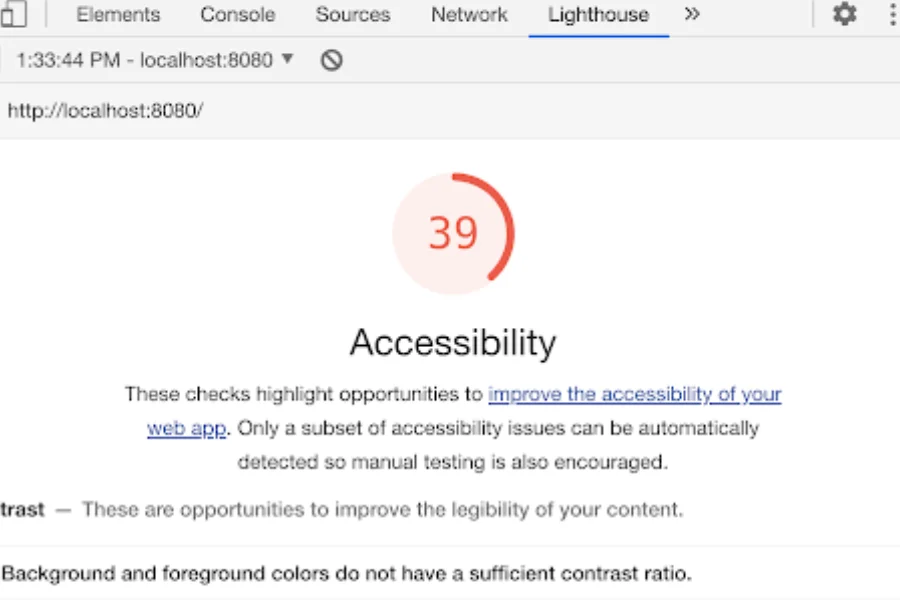
Accessibility Comes First
If your script scrolls the page, make sure it does not confuse screen readers. People using keyboards or voice commands should land where they expect, not at the top of the page. You can test this yourself. Press tab through your app after adding the code. If the focus jumps around, tweak the script until it feels natural. This small step keeps your mobile Safari accessibility safe for everyone.
Keep Performance Lightweight
On iOS Safari, heavy JavaScript can slow down pages and even cause flickering when the toolbar hides. A small script often does the job better than a large framework. Start with a simple scroll nudge and see if it works. You can also check user metrics to learn if people spend more time in your app or bounce less after the toolbar collapses. If the numbers do not change, keep it simple and avoid extra code.
Testing & Troubleshooting on Real Devices
Hiding the Safari toolbar in a Laravel app on iPhone sounds simple, but real testing often tells a different story. What works perfectly on your phone might fail on someone else’s. Different iPhones and iOS versions can react in surprising ways. It is like buying the same shirt in two sizes—one fits just right, the other feels off.
Test Across Devices and Modes
Do not trust a single test on your own phone. Try your app on several iPhone models and iOS versions. Open it in Safari tabs and in standalone mode if you built a Laravel PWA. If you cannot test on many devices, use tools like BrowserStack to simulate different setups. This extra step helps you spot problems before your users do.
Common Issues to Watch For
When the mobile Safari toolbar is not hiding, common causes include:
- The page is too short to scroll.
- Scroll scripts fire too early.
- Missing meta tags or PWA manifest details.
- Cached service workers blocking new changes.
Quick fixes often solve these headaches. Try clearing the cache, reloading the PWA, and double-checking your meta tags. Small changes can make a big difference.
FAQs
Why doesn’t Safari hide the toolbar after clicking a link in my Laravel app?
Safari only hides the toolbar when you scroll down. A link click alone does not collapse it.
Can developers fully control the iPhone Safari toolbar?
No. Apple blocks full control. The best options are scroll tricks or using PWA mode.
Why is the mobile Safari address bar not hiding even after I added meta tags?
Usually the manifest is missing details like display: standalone, or the page is too short to scroll.
Does the scrollTo(0,1) trick still work on iOS?
Yes, but it is not reliable. It can fail if the script runs too early or in single-page apps.
How do I fix iPhone toolbar not hiding in a single-page Laravel app?
Trigger a small scroll after each view change. This makes Safari collapse the bar.
Is turning my Laravel app into a PWA the best long-term fix?
Yes. A PWA in standalone mode removes Safari’s toolbar completely.
Where should I place the JavaScript code to hide the toolbar?
Place it at the bottom of your Blade layout so it runs after the page loads.
Will hiding the toolbar affect accessibility?
It can. Sudden scroll jumps may confuse screen readers, so always test carefully.
Can I test toolbar behavior without owning multiple iPhones?
Yes. Services like BrowserStack work, but real devices give the most accurate results.
What’s the fastest way to reset if my toolbar fix breaks things?
Remove your script, clear Safari’s cache and service workers, then reload the app.
Conclusion
The iPhone Safari toolbar not hiding problem can be frustrating, but the good news is you can solve it with a few simple steps. The fix is not about one trick. It’s about combining the right setup with careful testing. Think of it like tuning a car one small adjustment alone won’t work, but together they make the ride smooth.
Here’s a clear plan you can follow:
- Add a JavaScript nudger: Use a small scroll script to “nudge” Safari so the bar collapses after a view change. This is especially useful in single-page apps.
- Set up PWA meta tags and manifest: Your manifest should include
display: standaloneand proper app icons. This allows your app to open in full screen without the toolbar. - Connect with SPA frameworks: If you’re using Vue, Inertia, or Livewire, link the scroll nudger after every route change. That way, Safari knows when to hide the toolbar.
- Test on real devices: Services like BrowserStack can help, but real iPhones with different iOS versions give the most accurate results.
By following these steps, you’ll make your Laravel app smoother and finally fix the mobile Safari address bar not hiding issue.
For more technology guides and web development tutorials, visit Word Orbit.